Update on myPortal
October 2, 2018
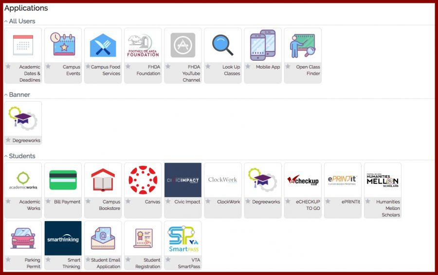
The Foothill – De Anza Community College district released a newly updated portal on Tuesday, Sept. 4.
Everything is placed onto an “Apps” page and allows users to personalize their portal using a new drag and drop feature.
It also allows users to search for whatever service or app they need, using a search bar.
The new change was a result of the old myPortal’s technology platform no longer being supported by the vendor, said Vice Chancellor of Technology, Joseph Moreau.
“MyPortal had become very dated and obsolete,” Moreau said. “The new ‘app’ or ‘tile’ based design is quite a bit more modern and works much more effectively with small form factor devices, i.e. smartphones and tablets.”
Some De Anza students said the new changes were confusing.
This new change will definitely take some getting used to for both students and faculty,
Bryan Vuong, 19, undeclared major said.
“I do find it inconvenient when myPortal keeps making new tabs for almost everything I click on.”
Michelle Sit, 21, graphic design major, said the new design frustrated her.
“I honestly prefer the old design better because, after I log in, everything is laid out for me,” she said.
“For the new design, I have to go through multiple tabs to get to the thing I’m looking for.”
