
PREVIEW: De Anza’s website gets a much-needed update
While De Anza faces unprecedented changes and uncertainty abounds, the updated website is a promising step into the future.
April 30, 2018
*Editor’s note: a previous version of this article stated that Vice President of Student Services Rob Mieso is related to a member of our editorial staff, which is false.*
De Anza College’s website has been an eyesore for years now. Despite our “heart of Silicon Valley” location and abundance of programming talent, the website makes De Anza look, for lack of a better word, crusty. Fortunately, it seems the marketing department has heard the cries of those who could never find up-to-date information on, well, anything. De Anza’s new website goes live on May 1, and La Voz got a preview.
Aesthetic
Here’s the current homepage. Take a good look, because this beauty won’t be here for long:
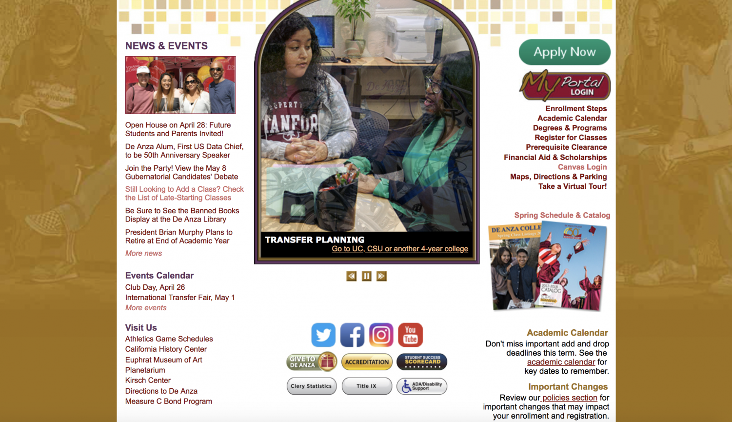
All text is legible, there are some nice photos — it’s not, you know, burning my eyes. However, the aesthetic is outdated and perplexing. What is that background: weird blocks that were cool and modern ten years ago; bizarrely filtered, not-particularly-relevant photos of students? Everything is crowded together, unpleasant to look at and difficult to navigate. The social media logos are discordant; the layout is wack.
Here’s the new site:
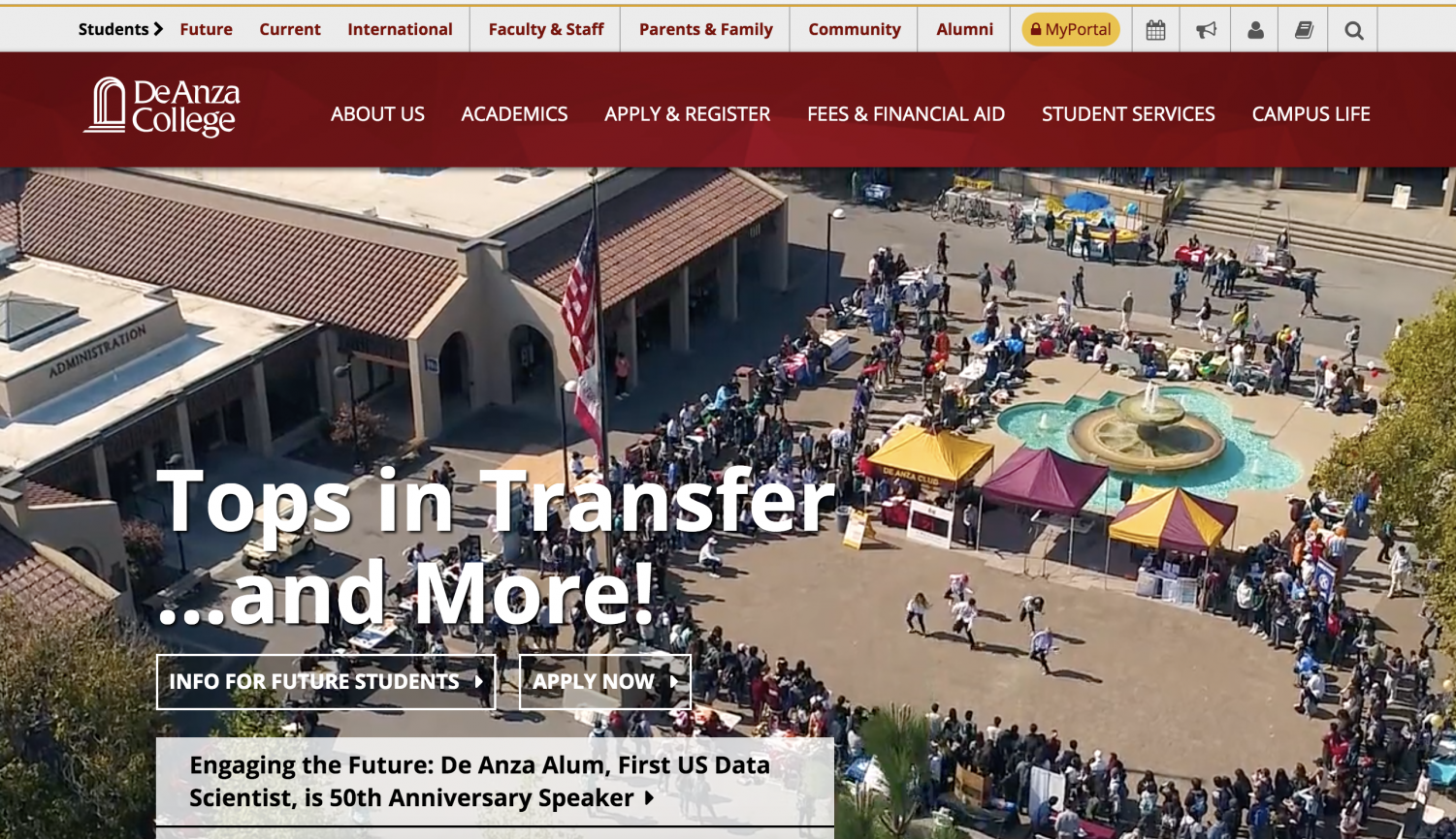
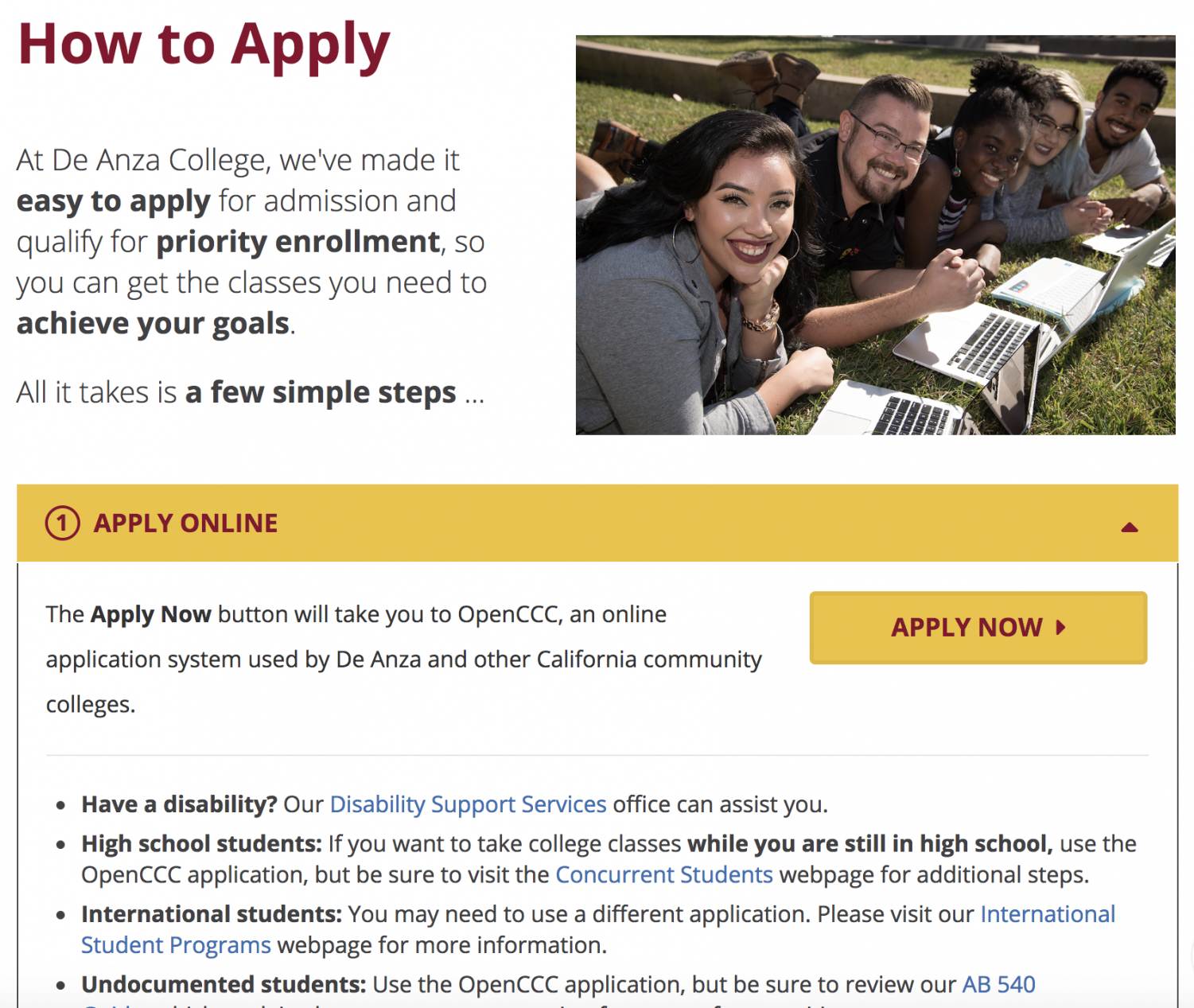
Drone footage? Of De Anza Community College? Who would’ve thought! The new site is dynamic, with interesting, appealing photos and videos. The text-dense pages have been broken up into lots of interactive visuals: for example, text appearing when you hover over a photo.


As you scroll down the homepage, you encounter basically everything you need to know to find your way around the site. Aesthetically pleasing, clear links advertising De Anza’s many programs and resources???? Incredible.


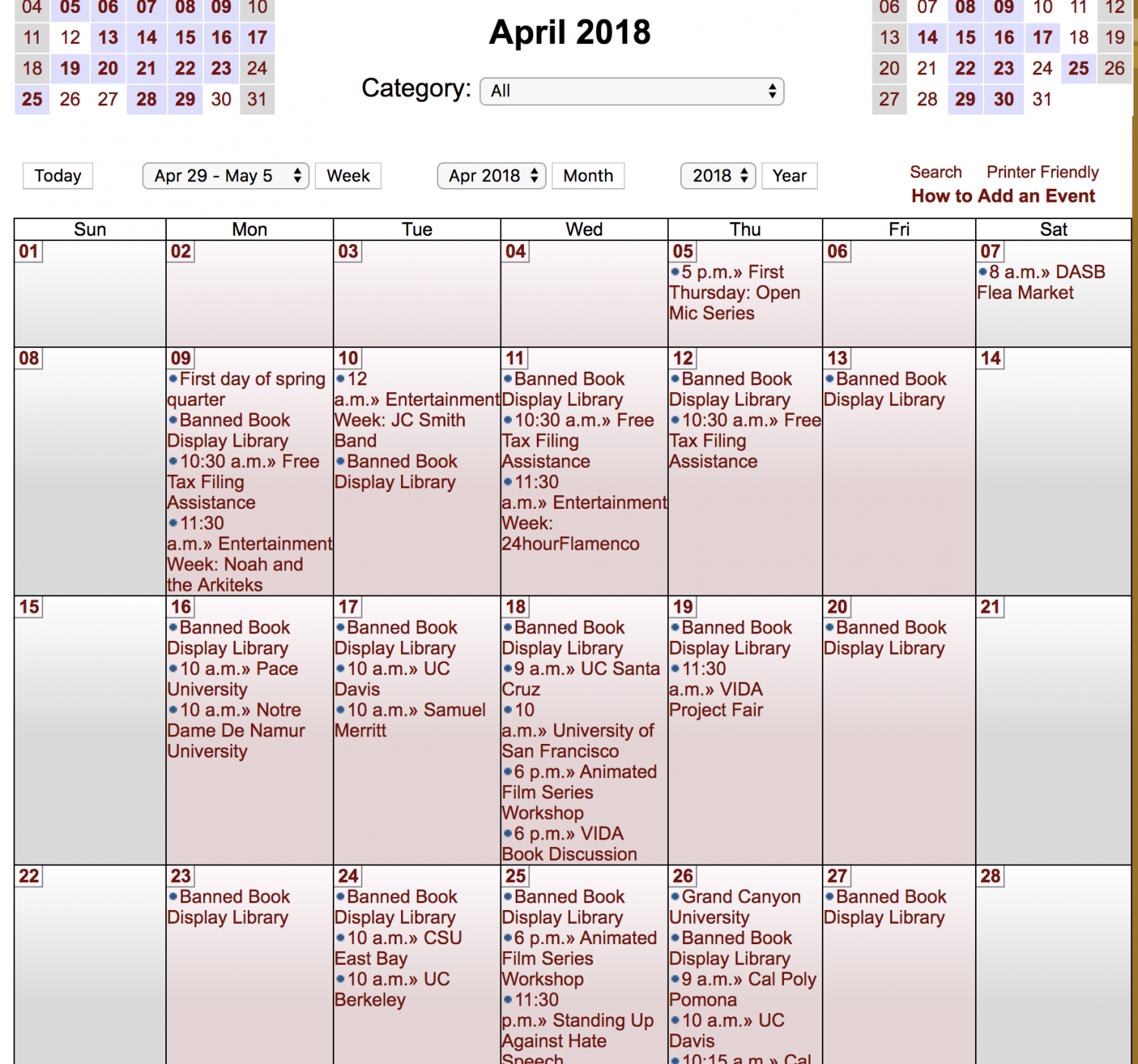
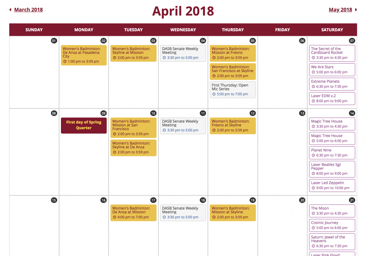
The new calendar (right) doesn’t list as many events as the current one, but that may very well be a product of the site’s beta status. The new site integrates the athletic calendar with the regular one, which is especially welcome considering the current athletic calendar is never updated.
I’d still like to see important academics dates and deadlines on the calendar as well, so everything students need to know is in one place.
However, the new calendar is much cleaner.
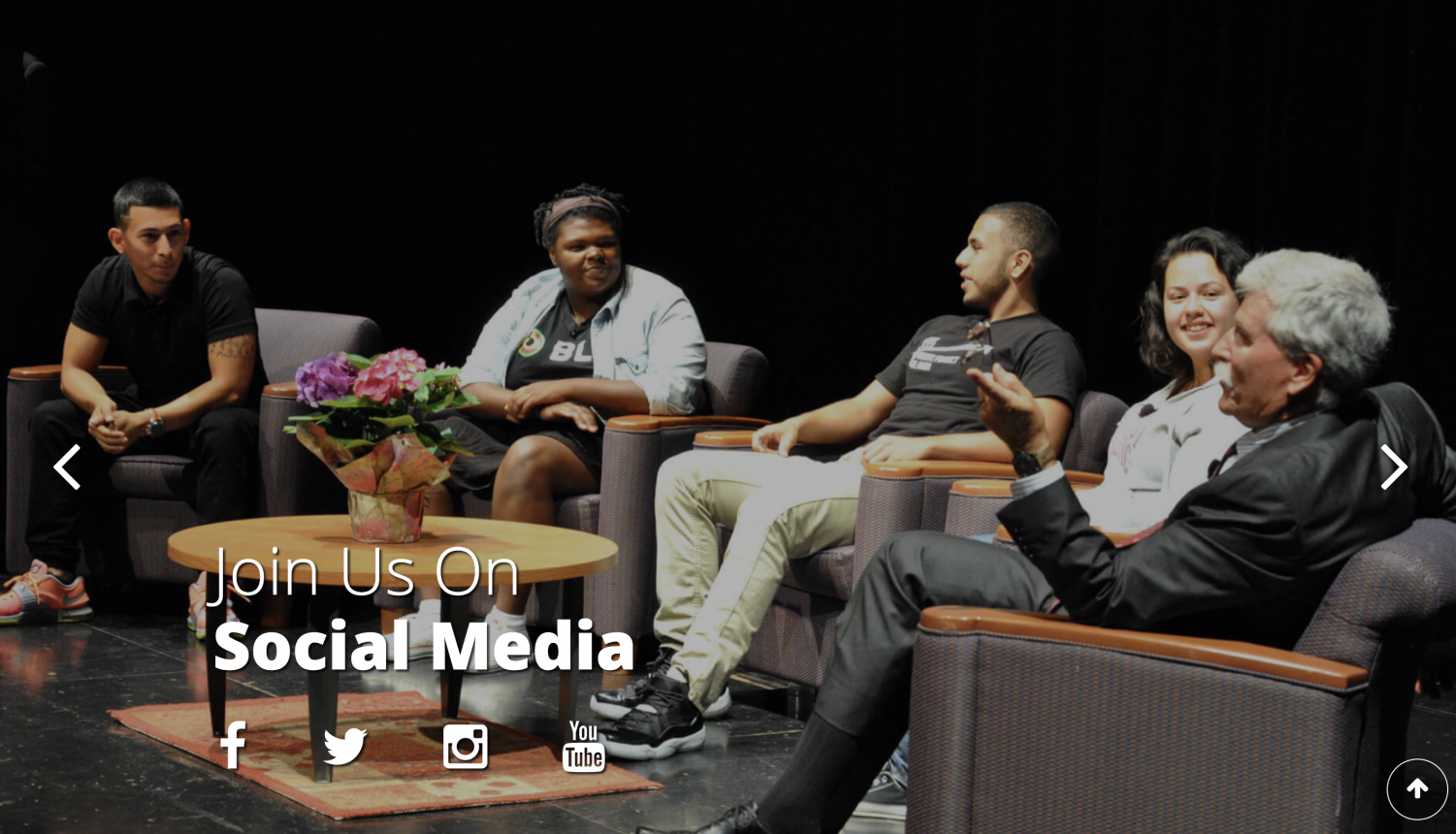
In place of the ugly social media logos, we have a savvy Brian Murphy inviting the world to join De Anza on social media.
Though there are still pages with lots of information, it is arranged in a more accessible way, with the important stuff visually emphasized.

There are still some not-so-candid photos:

Don’t get me wrong, they’re adorable, it just feels a little forced.
Usability
In order to find what I’m looking for, I often resort to googling “*search topic* de anza” because the site is counterintuitive and somehow even the search bar struggles to yield helpful results.
The current site boasts a whole bunch of defunct contact information and many out-of-date pages. See the budget page below:

While the new budget website is clean, modern and frequently updated, is a single, centralized website too much to ask? Finding information is a nightmare.
The beta site does not have a true search function, so I can’t speak to that; however, faculty and department sites have been slowly updated, so hopefully the new site will connect to those, instead of the old pages.
Critiques
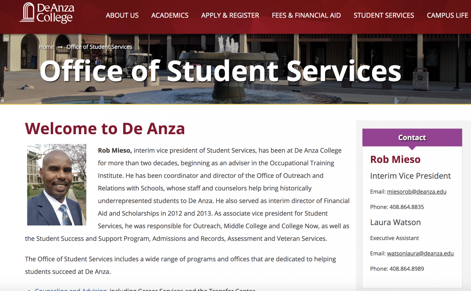
Design of the ‘Student Services’ page – linked in the site’s prominent main menu – is a misstep, in my opinion. While I’m sure Rob Mieso is a great guy, the more important stuff — what current and prospective students actually need to know about available services- is below a comprehensive bio and picture. I think his bio/photo could have been relegated to below the relevant links or to the ‘contact’ sidebar. Of course, that’s a choice on part of the design team, not Mieso himself, and he seems like a cool guy.
I don’t think the ambiguous “…and more!” is an improvement upon the already lackluster “Tops in transfer” mantra. “Just what you need” isn’t a particularly inspiring tagline, either. De Anza’s Community Education programs also seem direly under-advertised. This isn’t exclusive to the website, but it’s another prominent aspect of De Anza’s image that may merit reconsideration.
What will we miss from the old site?
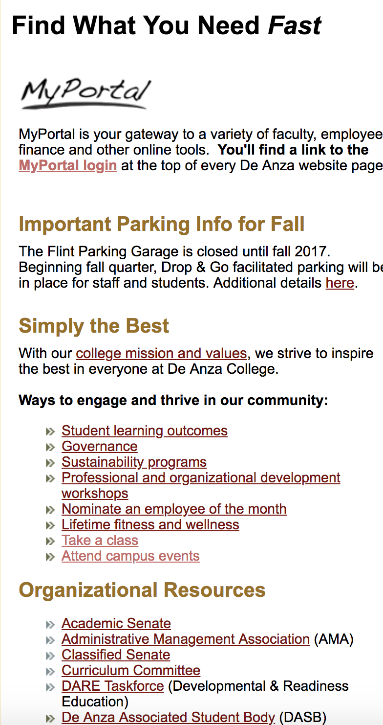
First of all, below you see just a fraction of the most useful list on De Anza’s website. With all of those links, it’s really easy to find what you need fast, and you only have to click through four seemingly unrelated pages to get here. I will miss this valuable resource dearly.
This iconic duo has inspired confidence in De Anza’s modernity since the ’90s. The authentic clout goggles helped me realize that this is truly the school for me.

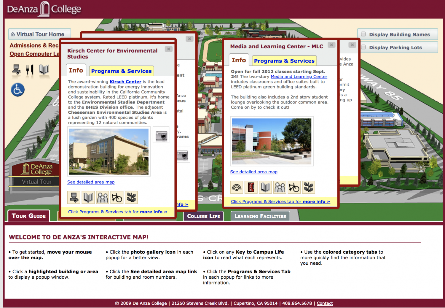
More than anything, I will miss the virtual map that helped myself and possibly others find our way around campus every quarter.
In light of declining enrollment, public image is more important than ever. While De Anza faces unprecedented changes and uncertainty abounds, the updated website is a promising step into the future.